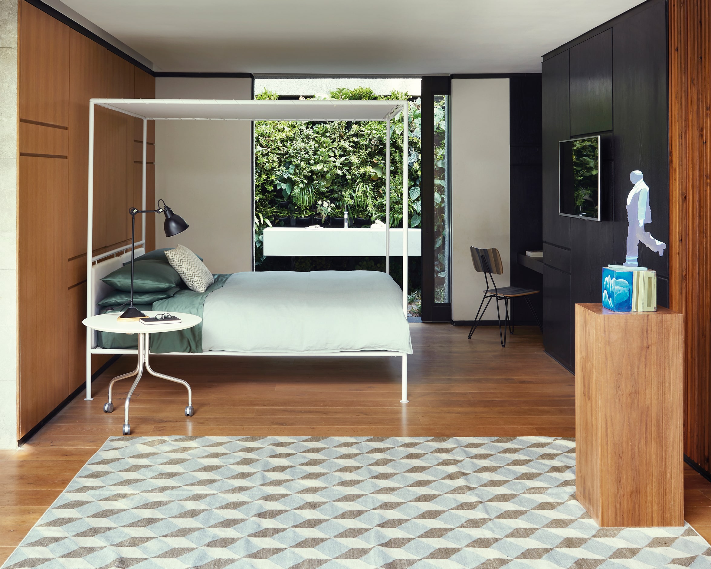
Don’t panic: poor design can be fixed — without bashing down walls or taking out a second mortgage. We asked interior designer Mel Cook for her quick-fix solutions to common design flops.
We’ve all got that one spot in our home, where you stand and wonder: “What were they thinking?” Whether it’s abnormally low counter tops, an oddly placed window or a sudden drop in the ceiling, we tend to inherit the random design decisions of homeowners past and (try to) turn a blind eye. The problem just seems too entrenched to fix.
But even after all is said and done and set in concrete, there are simple ways to fix things – not always by renovating, but by playing with visual variation, believes interior designer Mel Cook, the founder of Cooked Studios.
“Why architects and interior designers work so well together as a team is that they see things the other one might miss. An architect might just look at how plumbing needs to function and not necessarily the experience of a bathroom,” says Mel. “There might be a massive geyser box over the bath or the loo is shoved into a corner right in front of the door, whereas if you build beautifully clad plumbing ledges or add great finishes to create visual variation then things become a lot more interesting and your experience of the bathroom shifts. Designers get things right when they consider both the functionality and the aesthetics based on what it needs to feel like”.
Every site is different and will have its own challenges, she notes. What works in one home – or even in one room – may not necessarily translate well to another. “If you can’t think of a solution, you do have some options: Google it, ask ChatGPT, call an interior designer or just invite some of your friends around for a brainstorm. Have a glass of wine and make it fun,” Mel laughs.
“There will always be a forgotten exposed pipe or something, but you can find a creative solution. Do as much research on your site as possible, as early on as possible, so you can plan a fix. Don’t be disheartened, because things will come up but so will a solution.” But before you despair, read on: We picked Mel’s brain for easy solutions to some of the most common design disappointments…
Low Ceilings
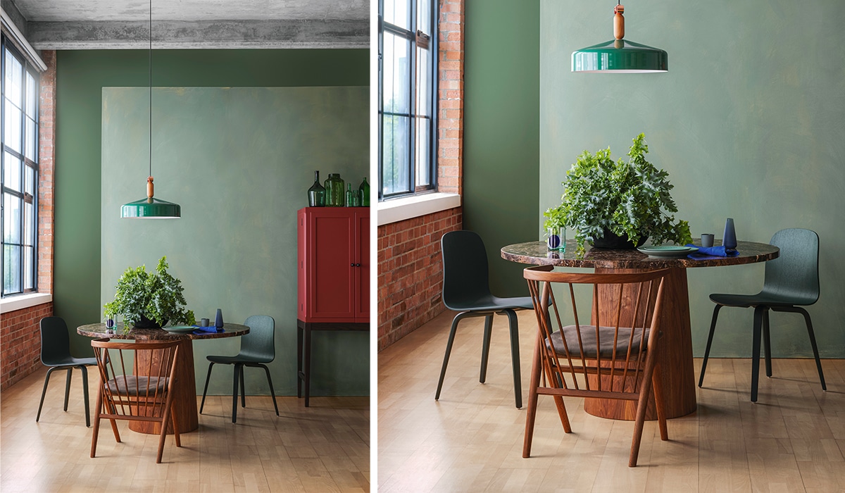
You want to do something to draw the eye up, such as floor to ceiling curtains. Some people cut curtains to end just above the window, which actually ends up
shortening the ceiling. If you have a full wall of curtains, the walls look taller. Another option is to paint the ceiling: lighter colours make the room feel wider and taller, and darker tends to make things feel cosier. It sounds counter-intuitive, but placing dado rails slightly lower than usual makes the room feel taller.
Hanging big artworks and adding wallpaper also makes things feel grander and add interest along the walls. The biggest thing is lighting: light up the entire room, not just the middle, to avoid dark corners. If it’s more balanced, then visually the room will feel fuller and much wider.
Small Rooms
Build the room in layers to create more visual impact and more spaces. When it comes to storage space, for example, swap one massive built-in cupboard for a few different options. If you raise your bed by half a metre, you could add drawers beneath it. In a kids room, it’s a great idea to have bunk beds with storage underneath.
Add texture and variety to make things seem bigger, which can include using a dark paint colour because it adds depth and soul to a space.
Choose the right sealer for the right job
One of the greatest challenges facing a prospective DIY-er is how to choose the correct sealer to best protect a wood project, be it for a revamp of existing joinery or furniture, or for new woodwork. The implications of a wrong or ill-informed decision are dire, as re-finishing usually involves stripping and/or sanding the wood back to a bare surface and starting anew. Woodoc has a solution: The Woodoc Web-Based App is the ideal tool to make choosing and using the correct woodcare product easy and fun. Simply scan the QR code via your mobile phone camera, and the application is instantly and automatically displayed on the mobile phone to give guidance on the correct Woodoc products to use for any project. If further guidance is needed, the Woodoc toll-free helpline (0800 411 200 during office hours) may be called directly from the application.
Windowless Spaces
It’s all about styling to create variety, even without natural light. If everything is very much the same all the way around the room, then it can start to feel claustrophobic.
Especially in bathrooms, it’s key to have a big mirror and bring in some wall lighting. As a side note, consider an extractor to absorb the moisture in the bathroom if you don’t have any windows.
I would also suggest having more than one type of light to bring in variety: a ceiling light and then either a floor light or lights hanging next to the mirrors. Visually, that’s where it starts to add a little bit more tonality. Don’t be afraid to play with wallpaper and paint to keep things interesting.
Low Natural Light
That’s never ideal, but it does depend on the kind of room you’re dealing with. I would assign that room as a spare bedroom, cinema room or bathroom, which doesn’t need as much natural light as maybe a home office or kitchen would. It really depends on your other rooms and how you prioritise accordingly. If that’s not possible, there are still workarounds.
Add texture to make it feel cosy and ambient with wallpaper, different light sources or an interesting ceiling feature. It will draw you into a surrounding experience, rather than let you notice something might be missing.
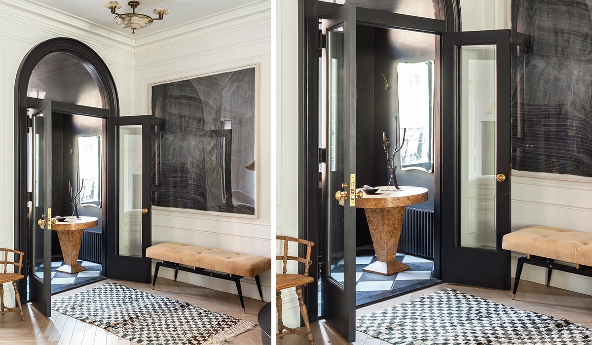
Tight Entryway
Take the door off, maybe not your front door, but solid doors in small spaces. Replace it with something that creates space, such as saloon doors, a folding door or sliding doors. If you still want the solid door, then switch the hinge to the other side of the doorframe. If it makes sense to you, then go for it. Throw out the rule book.
Lack of Privacy
From Neighbours For windows, you can add one-way mirror film so that you can look out but people can’t see in and you still get all the natural light possible. Just be mindful that this reverses at night, so always remember to draw the curtains! Another option is to sandblast a portion of the window, so you get privacy and light.
For balconies, you can always set up screens or green covered terraces with beautiful bougainvillea or green ivy. Privacy and greenery in one!
Words by Christi Nortier
Photo: Bureaux, Future
Also read: Bedroom design tips for better sleep


