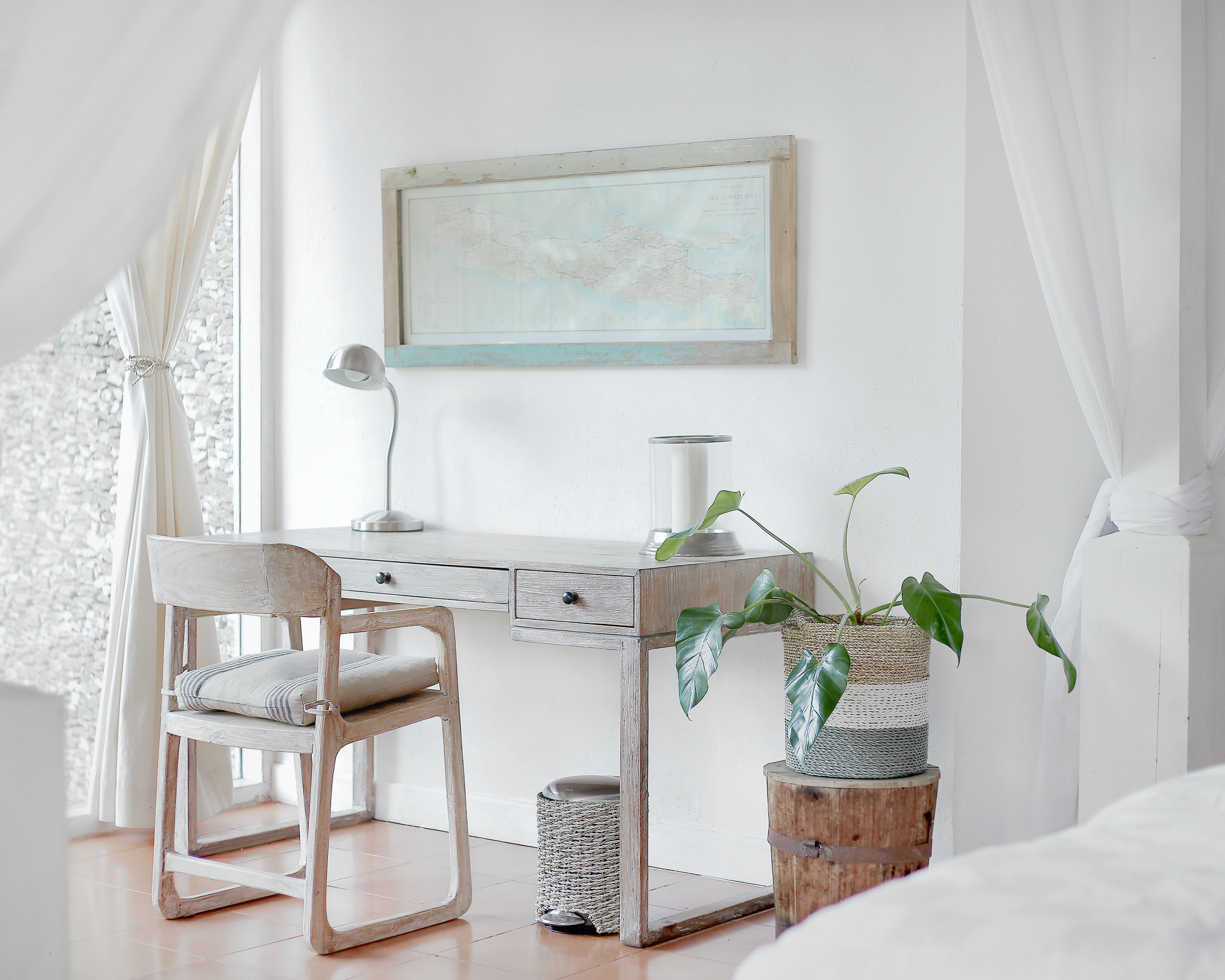
The ancient Egyptians and Romans valued it as a symbol of purity, and today, the colour white has become a symbol of calm – a space to rest your eyes as well as your mind after the busyness of the day’s events. Livingspace spoke to well-known interior designers Anna Correia and Steven Graham on how you can best use white in your home.
Cotton Bloom
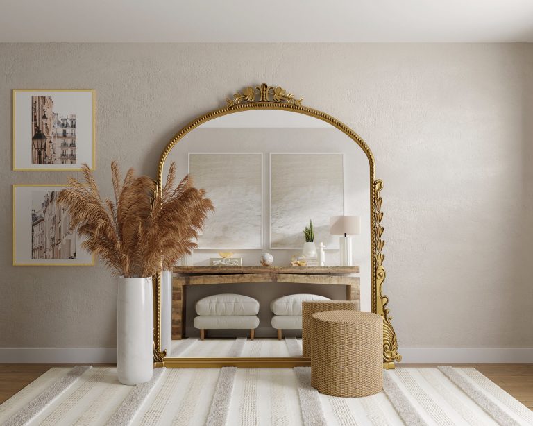
Anna – This is a great colour that you can carry through the entire house. This will create a natural, simplistic feel, which you can either layer with contemporary bright colours or a pastel colour palette.
Steven – The lovely pink undertone in this colour makes it a wonderful choice for a stylish children’s bedroom. 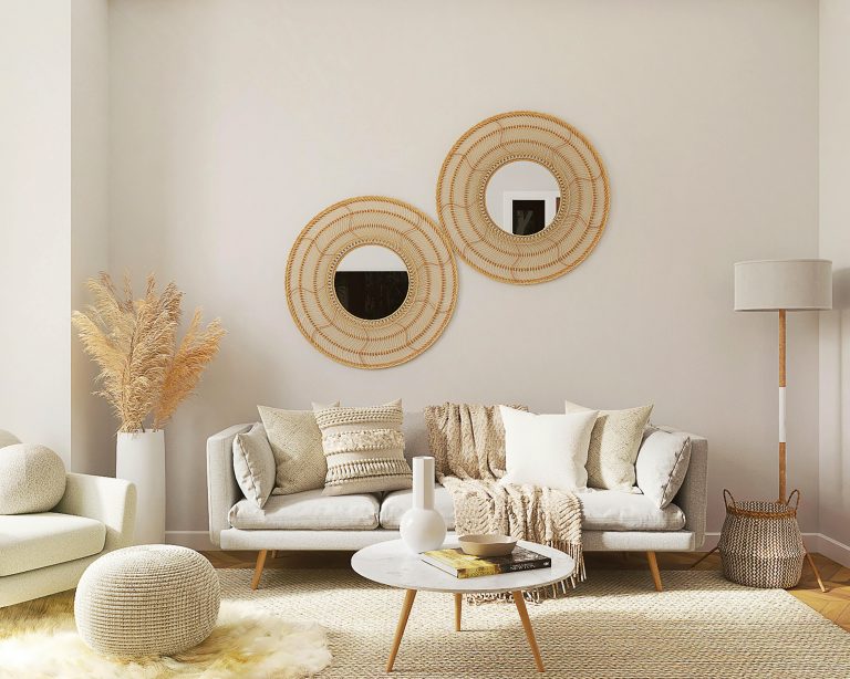
Ivory Snow
Anna – A great in-betweener, this shade creates a calm space. It works well with the freshness of whites and pastels, and will add a romantic touch.
Steven – A stone colour perfect for both interiors and exteriors. Its neutral tone means it will work with any colour scheme. You can also use it to create a feature wall and show off the room.
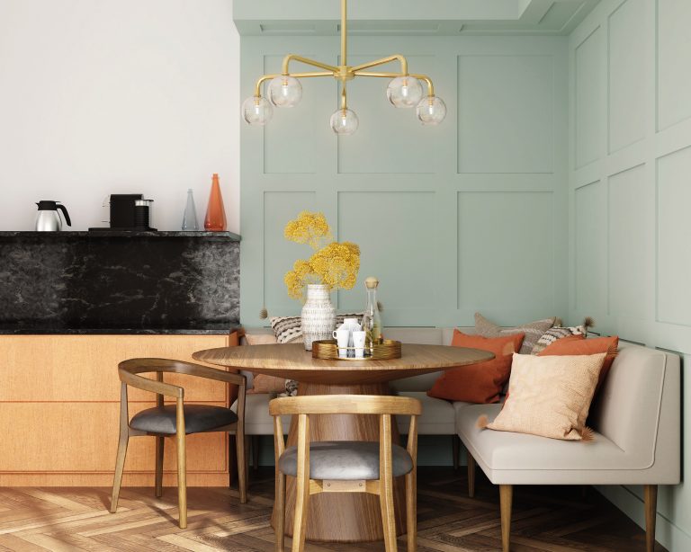
Almost Pistachio
Anna – A soft pistachio is the perfect shade for bedrooms and living rooms. Create a romantic mood by mixing it with pastels. For a contemporary feel, add shades of green, whites and punches of softer tones.
Steven – Accent this with white shelving, artwork framed in white or soft white curtaining, and these tones will stay fresh.
White Canvas
Anna – This beautiful chalky white shade is just great for bedrooms, and to carry right through a home. It creates a sense of openness. Compliment it with natural colours and even more whites.
Steven – This is a firm favourite for master bedrooms. Pair with trending colours such as sage green or duck-egg blue.
Words by Kay jones
Photography: Unsplash/ Courtesy images


