Architect and furniture designer Timothy Penfold showcases his newly renovated Cape Town cottage, which is now different in all the best ways.
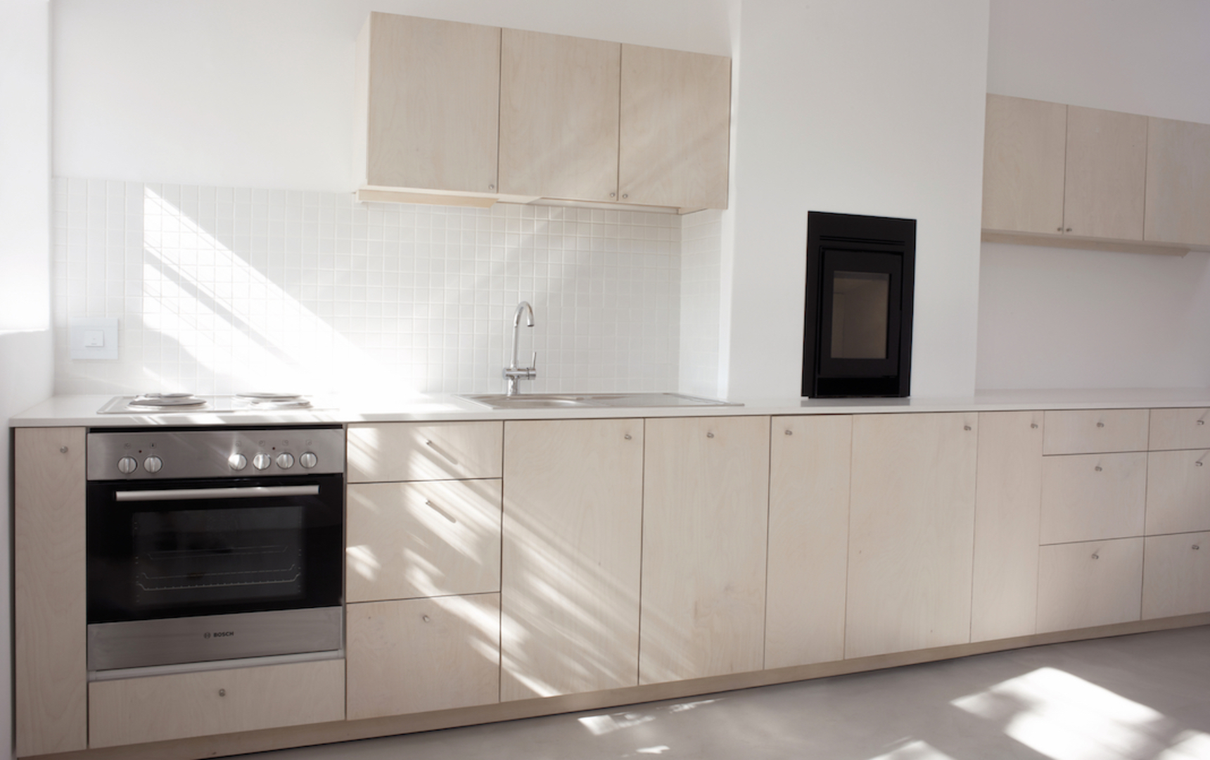
It’s an old semi-detached cottage that was in much need of a facelift to, well, ‘extend it’s already long life’. But instead, of adorning the already small space with trinkets and trimmings, owner and architect Timothy Penfold opted to strip it down to its bones, cover it with a light wash of paint and allow soft grey and bright whites to run throughout. While still adding a touch of warmth to the compact home with a birch ply finish and a slow-combustion fireplace.

Brief understanding
The concept was quite simple: ‘Make the space feel larger and brighter by visually connecting to the courtyard behind [the deep galley kitchen],’ says Timothy. And was this achieved? Yes. Though he had initially set out to ‘replace the rear brick facade with massive glass and steel doors’, Timothy confesses that after a quick reality check and a glance at the bank balance, this grand idea would not be so simple and would be quite costly to achieve. Instead, he chose to focus on freeing up the space by allowing the maximum amount of light to filter through an alternative means. Timothy did this ‘by utilising the bare minimum of materials and colours, allowing the space to feel like a blank canvas’.
The cottage had an existing fireplace, and while it may not have been working very well (there was soot cascading down the chimney), keeping the feature would be a lovely luxury to have. And so, Timothy decided that it had to stay. ‘I modernised it by installing a small slow-combustion wood-burning stove within the existing fireplace niche,’ he explains.
When working on a personal project to create the ultimate dream kitchen, it could be challenging to refrain from going a bit overboard. ‘I just wanted to get going and figure out the costs as I went along,’ he shares. It turns out it was his wife who practised restraint. ‘Once I had a clear budget, it helped provide a framework within which decisions could be made,’ he says. This ultimately helped eliminate feelings of regret at the end of the project.

‘The heart of the home’
To give the illusion of a larger and brighter space, Timothy says: ‘I used as few materials and colours as possible, so that your eye wouldn’t get distracted by detail. I used the same white externally and internally, as well as on all windows and door frames,’ he shares. He also added a touch of warmth by running birch ply throughout the kitchen cabinetry.
No renovation job comes without some challenges though. While original flooring may add to the charm of the space, having serious rot underneath the floorboards in a small room is not something that we would call charming. ‘It is important that the floating timber floors receive subfloor ventilation,’ he stresses. Unfortunately in his own home, the issue of ventilation for the timber floors proved to be something that could not be solved. ‘I opted to lay a concrete floor,’ says Timothy. ‘This turned out well, as I could keep one floor finish throughout the entire house.’
Let there be light
Make a big change with a small budget: ‘Use a fresh coat of paint,’ says Timothy. ‘If a space has lots of natural light, I favour light colours. If it has few windows and is a bit gloomy you can afford to go with darker and more interesting colours. It’s a mistake to think that white paint can lighten a dark room – only natural light can do that.’
Words: Dylon Phillips | Photography: Courtesy Images


