Johannesburg architect Anthony Orelowitz has designed a home for his family that reinvents what it means to have a haven in the city.
In Johannesburg, there is no mountain,” says architect Anthony Orelowitz. “There’s no ocean.” He is referring to Table Mountain in Cape Town, South Africa. Houses in Cape Town tend to look outwards, seeking to catch a glimpse of the ocean or frame a view of Table Mountain. “Here, you have to create your own habitat,” Anthony says.
That, at heart, was the basis of his response to Johannesburg’s urban character when he designed his own home in the city’s famously forested suburbs. Anthony is primarily a commercial architect and his firm, Paragon, is responsible for some of the most significant architectural landmarks in the city. But, he says, “I hadn’t done a house in nearly 15 years.” Nevertheless, working closely with architect Elliot Marsden and interior designer Julia Day, he conjured a vision of what it means to make a home in Joburg, at once perfectly suited to the city and utterly unlike its neighbours.
The plot of land Anthony was to build his home on had previously been a tennis court: accessed via the long driveway at the end of a ‘panhandle’, surrounded by neighbours on all sides and far from the street. It felt like a self-contained island with huge jungly trees in a sea of suburbia.
Julia was involved from the very earliest stages, so the ideas that drove the design have been sustained right down to the tiniest details. She says that working on this house was unlike any other she’d ever worked on.
“Details everywhere were customised as we went along,” she says. She recalls redesigning entire bathrooms so that the tiling layout would be perfectly even, lining up exactly with the doors, no trimming or uneven size tiles necessary. Designing, engineering, building and decorating were one endlessly changing, unfolding experiment, evolving even as it took shape around them.
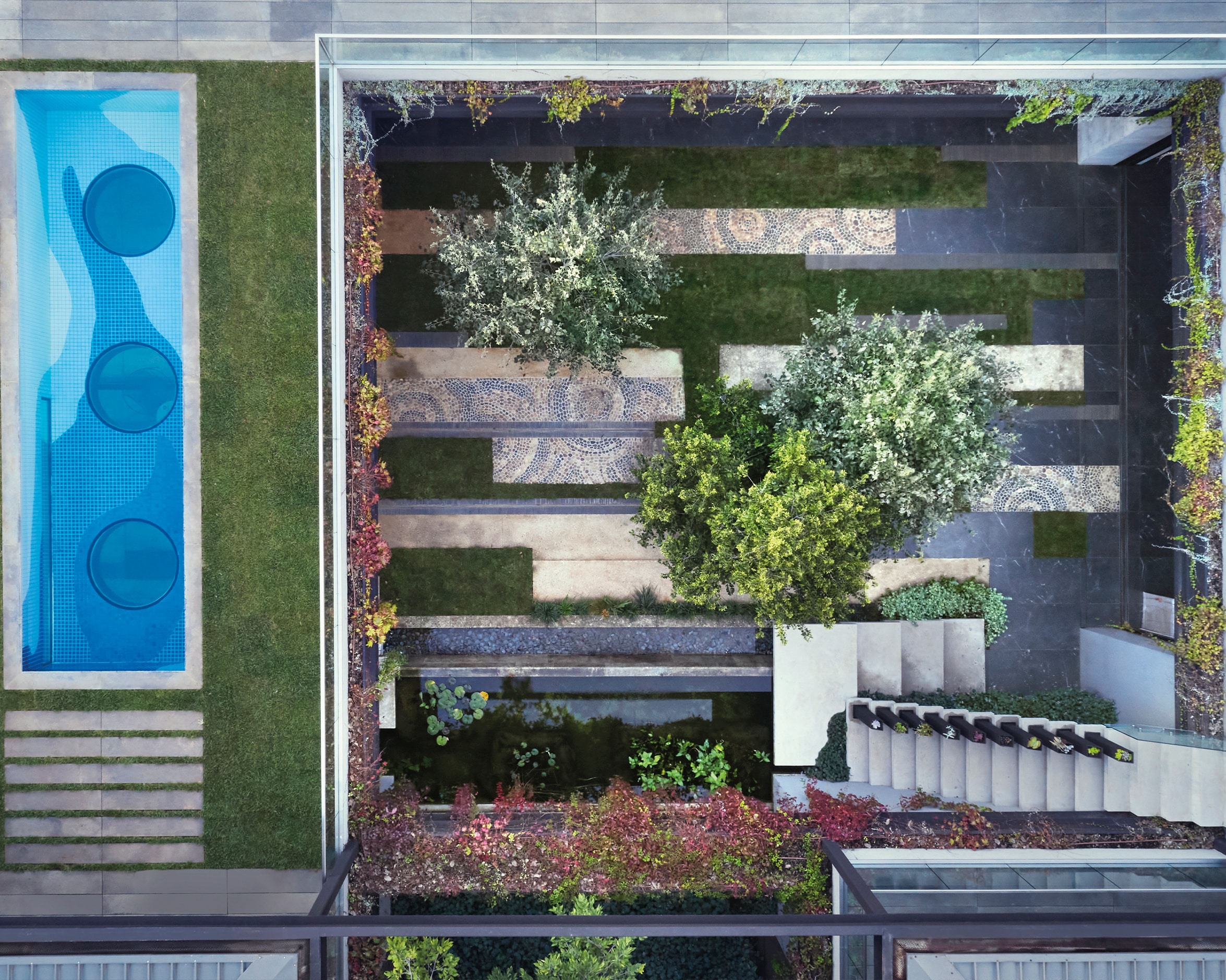
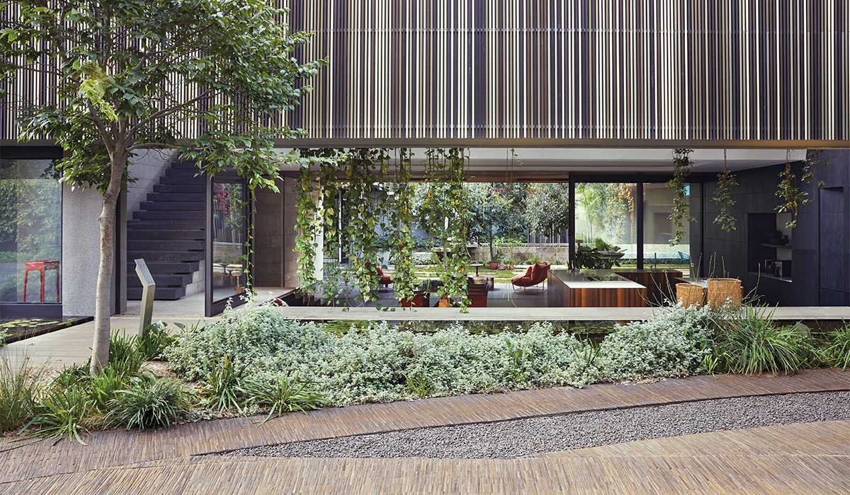
To create his habitat, Anthony turned to the archetype of the atrium house: an internal courtyard wrapped around on all sides by the house, creating a peaceful sanctuary at its heart, open to the sky. He calls it a “self-contained oasis in the city”.
The house itself is essentially a series of pavilions, with vast sliding doors and screens that can be opened and closed to reconfigure a mosaic of spaces in countless ways. They even had to design a new rail system to manage the massive glass panels which made up the sliding doors.
Rather than simply surrounding the central courtyard, however, Anthony describes the way in which he “pushed” the landscape through the pavilions and out to the very edges of the site. “The ground plane washes through the house completely from one end to the other,” he says.
This, he explains, creates “secondary courtyards” all around their house, where the pavilions open onto private, peaceful nooks under the trees, and the boundary walls in effect become the walls of the house.
Despite its long, low-slung look, the house also rises to create an upper level in the treetops, carefully designed around branches that lean into and over the house. It’s like a “big, adult treehouse,” says Anthony. The effect is a sense of space knitted together vertically as it is horizontally, drawing you up to the terraces as much as through the house and gardens on ground level.
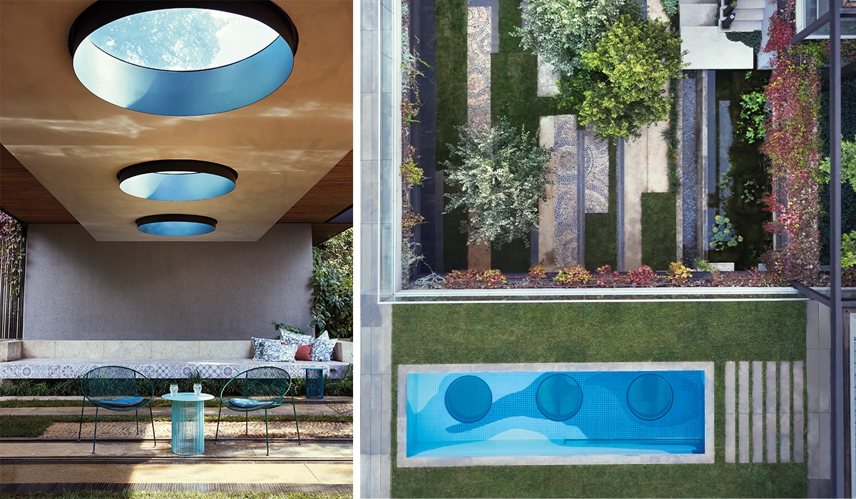
Anthony designed it “upside down”, with the bedrooms at ground level, nestled under the trees, and the living and outdoor entertainment areas – even the pool, with portholes underneath looking down into the central courtyard – on the level above. He says that when he wakes in the morning, he wants to “touch the ground” and “be in the forest”. The clarity and apparent simplicity of the design is, inevitably, a wonder of engineering, ranging from massive, brutishly strong “post tension beams” that wrap around the house (so well hidden by cascading plants that you’d never even know they were there), to a floating lounge floor suspended by a 90mm steel hanger from the ceiling above so that it seems to defy gravity.
Making tracks
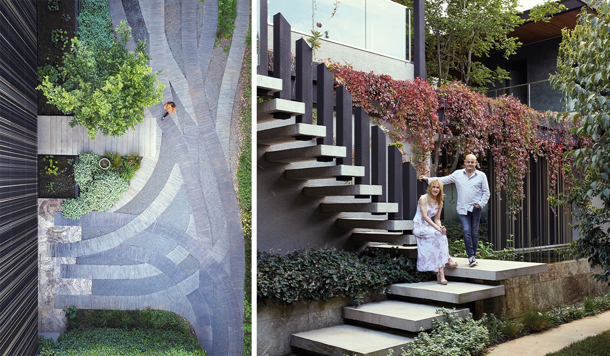
The driveway paving mimics the patterns of tyre tracks arriving and leaving, transforming an ephemeral pattern of movement into an artistic detail, and signalling the extent to which the architecture and design is all about movement and connections. Architect and homeowner Anthony Orelowitz and interior designer Julia Day on a staircase which ascends to the upper level.
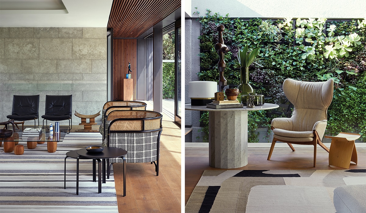
Julia says the carefully controlled palette of interior finishes was selected for its own natural, highly tactile, raw attributes. Anthony speaks of wanting “sensory feedback” when you touch surfaces throughout the house, from the walls to the floors. He says it’s a quality he finds rejuvenating. The rough sensuality of the natural stone, the lushness of the plentiful plants and the elemental presence of the air and water leans away from the minimalism of European modernism and in the direction of the lush, sensual tropical modernism with its early origins rooted in Brazil.
The tactile dimension and natural qualities bring a certain earthiness inside, but that “feeling” is enhanced by the way light comes into the house, the way air flows over a pond and up though a skylight – the movement and variations in temperature… The care taken with the detailing means that the transitions between inside and out become seamless in a way that houses often claim to be but aren’t. The slatted timber cladding that wraps the walls and ceilings have door and window frames so precisely integrated into them as to make the thresholds imperceptible.
The lighting (also highly bespoke) is concealed and designed so that in the evening and at night the quality of light inside and out is consistent. The effect is slightly magical. Despite the sleek beauty of the design, Anthony compares the Joburg house to Hogwarts School in the Harry Potter series of books, referring to the secret passages and trick stairs in the fictional school. He describes it more as a system than a set structure. “You’ve got hidden passages and concealed spaces behind spaces,” he says. The ways in which the walls and screens can be opened or closed in Anthony’s house means that it can also be quite magically reconfigured. It is forever shifting and changing shape. “It’s quite theatrical in a way,” says Anthony.
Unconventional cook
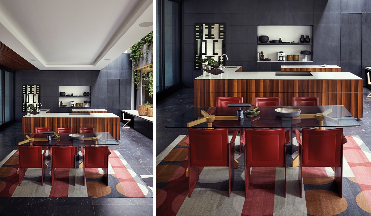
Anthony says that he didn’t want the kitchen and dining area to look like a traditional kitchen. Rather it’s a space to cook and entertain. The wood panelling at the back of the kitchen not only conceals storage, but a back-of-house kitchen and pantry.
Hanging gardens
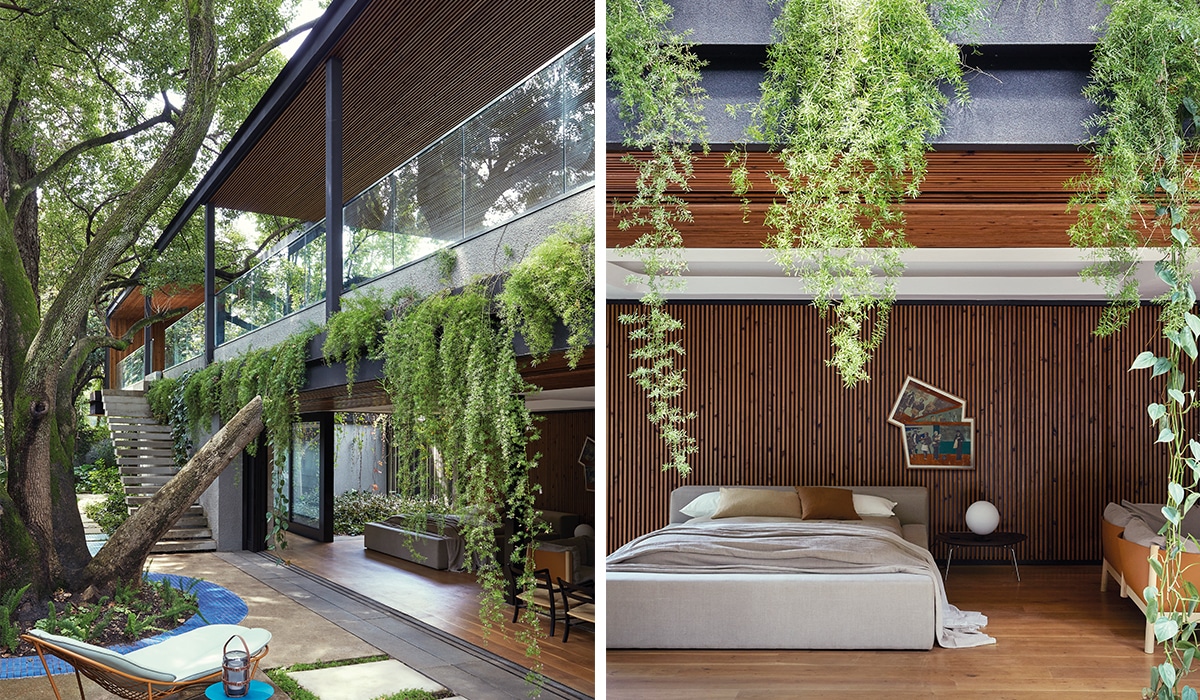
The courtyard on the far side of the master bedroom is one of Anthony’s favourite places – a quiet, serene space under the trees. Cascading plants cleverly conceal the massive steel beams while creating an almost tropical atmosphere.
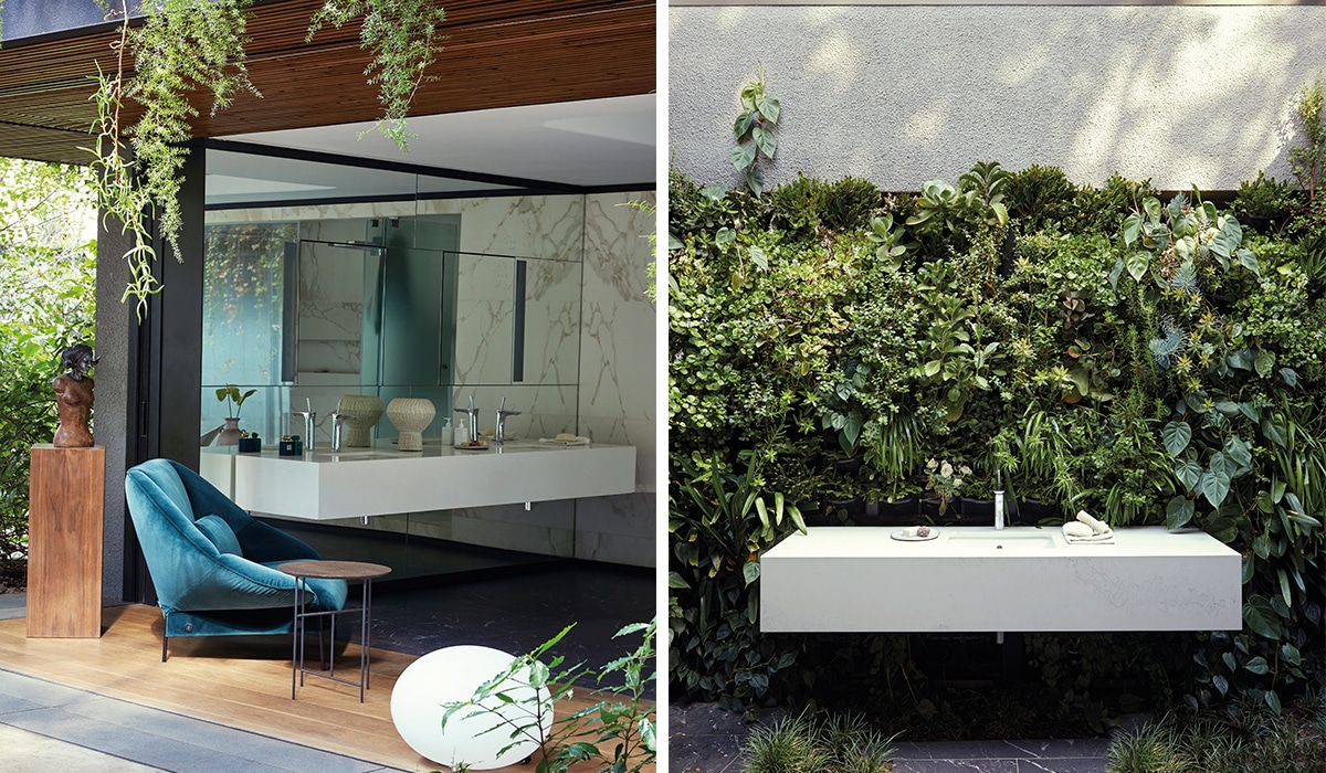
Some totally over-the top features, like the app-controlled automated skylight (about 20m long and 3m wide) that runs the length of the front of the house, add to the magical effect, transforming interiors into exteriors. “The walls are made of plants,” points out Anthony, referring to a vertical garden the length of the first floor.
Julia has continued this sense of surprise and discovery throughout the interiors, particularly in the ways she had detailed cabinets and wall panelling to conceal storage and even entire rooms. For instance, dressing rooms and a back-of-house kitchen open up behind what appear to be seamless panelled walls. The effect is that it brings the house down to a comfortably human scale.
Even in plain sight, Julia has worked some magic to ensure that all the openness and connectedness is actually habitable, and that the family fills the spaces with life. She says that large volumes and open flowing spaces also need “pods” and “cocooned pockets” that create cosier, more intimate spaces. If they’re not to be deserted, open-plan designs need to create spaces where people can “be alone together”.
So, as much as she has respected the architecture in her choice of furnishings, she has made sure that the house feels as comforting, welcoming and calming as it is surprising and delightful.
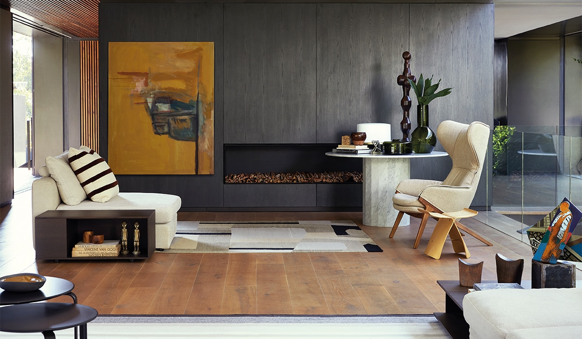
She has drawn heavily on designs from De Padova and the likes of Ligne Roset, Wiener GTV Design and local designers such as Haldane Martin. She points out that, not only are the individual pieces beautiful on their own, but they combine beautifully without “competing”. She favoured low-slung designs, often light, fairly transparent pieces that don’t interrupt lines of sight or “break” the views and the sense of flowing, continuous space. “There’s nothing that interrupts the eye,” as she puts it.
At the same time, she sought out designs strong enough to hold their own and not become lost in the space. “The house allows for sculptural elements,” she says. The architectural shapes of Haldane Martin’s outdoor furniture, for example, carried the language of the “hard shell” of the house into another dimension. But perhaps more importantly, she points out, she thought very carefully about the quality of the space that individual furniture pieces create around them. The furniture works in concert with the carefully choreographed architectural movement and connections throughout the home.
The powerfully interconnected space meant that she constantly had to consider the ways in which the furniture would “translate” as you saw it from different vantage points throughout the house. By the same token, she steered clear of designs that looked “overly functional”. The kitchen was conceived more as a social area where you could cook, relax and entertain rather than a traditional kitchen where it’s all business.
The interiors, she points out, were an exercise in layering, articulating and complementing the architecture rather than mere decoration. Natural textures are picked up in the fabrics, maintaining the sense of grounded, authentic materiality. The colours are drawn from the water, the foliage, the sky and the stone to “marry inside and out as one space”.
To maintain the sense of simplicity, subtle variations in colour, texture and material – the same granite hammered here, but sandblasted there – keep it from appearing monotonous or sterile. She embraced the overtly handcrafted, the sense of the human touch and the imperfect to bring a feeling of warmth and humanity to the space.
The secret, however, remains in the detailing, in being able to sustain a clear vision from the “big idea” right through to the tiniest detail
She even went so far as to embrace what she calls the “anti-perfect” at times and do something deliberately “wrong”. The patterned tiling on the built-in outdoor sofa in the central courtyard, for example, breaks the rules, but introduces something whimsical and refreshing that rings true to the spirit of the place. Julia quotes Vico Magistretti, who designed a number of her favourite furniture pieces, some included in the house: “Simplicity is the hardest thing to obtain.” It’s an effect more than a set of rules.
The secret, however, remains in the detailing, in being able to sustain a clear vision from the “big idea” right through to the tiniest detail. Of course, such painstaking attention only pays off if the idea is convincing in the first place. If it is, you have the making of an architectural landmark. The idea is elevated.
In this case, the idea was not so much to create a building or a house in the traditional sense as a place. “Can you make your home your favorite space in the city?” asks Anthony. The open courtyard at the heart of this home is an invitation to do so.
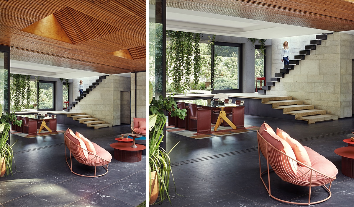
Blurred lines
On the lower level, the kitchen flows out seamlessly to a covered terrace with skylights. The stone floor, wall cladding and timber ceiling extend seamlessly from inside out, the tracks for the sliding door meticulously integrated into the finishes. In the main en-suite bathroom, which can be opened onto a courtyard, Julia has designed the marble showers to appear as if they have been “inserted” into the volume. The upstairs guest suite opens onto a beautifully planted bathroom, which can be completely opened to the sky with an app-controlled automated skylight.
By Graham Wood
Photographs: Ashleigh Frans/Wide Shoots
Also read: Ceramicist Jan Ernst’s fascination with light and landscapes


