A bold holiday home situated on the mountainside close to the historic town of Valldemossa, Mallorca, blends classic Spanish flair with modern touches
On the one side lies a forest of Mallorcan holm oak trees. On the other, a sea view in which, on most days, the division between the Mediterranean and the sky becomes blurred into a single vista of blue. And in between is this almost sculptural, stone-clad house. A house that combines the relaxed simplicity of holidays with an elemental, otherworldly quality that is difficult to define – but extremely easy to admire.
Situated between Valldemossa and Deià on the scenic west coast of the island of Mallorca, it’s a spectacularly positioned home in every way, but the house on the property has not always been a match for its site. Originally built in the 19th century, extended during the 20th, and finished off with a set of very ill-conceived extensions and renovations in the 1990s, the house was in a poor state when its present owners recently purchased it.

Architect Manuel Villanueva of Mallorca-based Moredesign was the lead designer on the renovation project that followed, and he says the original home was not merely unsightly. ‘When our clients bought the house it was almost collapsing, and legally out of code.’ And because the island’s strict building codes mean that a house cannot be completely demolished and a new structure built on the site, Moredesign had to come up with an architectural solution that incorporated the existing structure while also conforming to regulations – and satisfying the clients’ brief.
The solution was to ‘introduce a new structure within the existing building, then open up some spaces and demolish others’, says Manuel, explaining that the result was ‘the same [in terms of] volume but an entirely different interior space’. The house was also carefully ‘reconnected with the surrounding landscape in a way that reduced its environmental impact’, he adds.

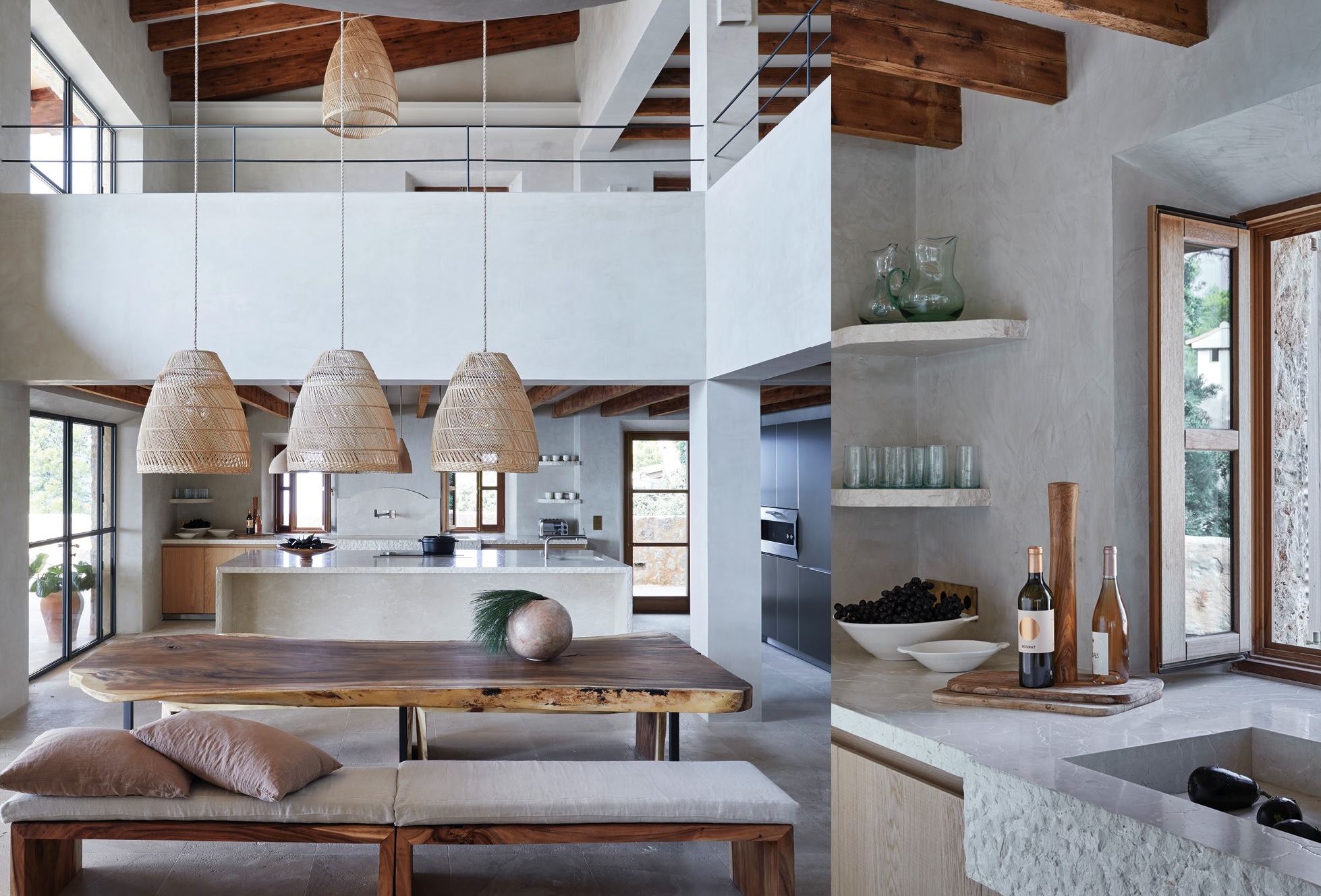
And what of the aesthetics of the design? From the start, Manuel says, the new home was ‘conceived as a dialogue between extremes: the mountainside with its prevailing green, brown, and orange tones; stone and oaks; and the other side, which is all about [shades of] blue and the breathtaking, unobstructed view of the Mediterranean’. These natural shades and aqua tones run throughout the house, but it’s the oatmeal-coloured walls and floors that make a serene backdrop for everything else.
The site is very steep, so one enters the house on its topmost level, which is where the spectacular swimming pool area is also located. From there, you walk your way down into the rest of the spaces, which also provide access to the lower areas of the landscaped garden.
Moredesign ‘conceived the house with two differentiated sleeping quarters,’ says Manuel – one for each of the families that own the house. One of them is situated across the top floors and the other on the lowest level. The middle portion of the house, ‘which features all the common areas, is shared’, he says. The feel across the communal spaces is dynamic yet refined and quietly sophisticated, with the double-volume central space forming an especially lovely part of the home, perfect for the families who holiday here regularly.

Like many successful design elements, the double-volume space does double duty in terms of a vast open aesthetic and its structural function. For example, Manuel explains that the design team managed to bring natural morning light from all levels ‘right through into the lower levels of the house from the patio windows and openings on that top level via the main double-height space’.

Another key element of the home’s elemental appeal is its striking stone-clad façade. Moredesign is especially pleased with the way this has turned out, as the team spent a lot of time and effort working on the way the stone was laid, in order to ‘vary the depth of the façade so it already has the visual appearance of the passage of time embedded in its skin,’ says Manuel.

The interiors were conceived and executed by More Decor, the interior-design arm of Moredesign, and combine inviting natural textures with an elegant sense of restraint. The floors, for example, are made from locally sourced stone that was used in many of the great palaces and historical buildings across Mallorca and have been incorporated throughout the common areas of the home, in a 60 × 60 cm format. They have a luxurious feel, but will also age naturally and take on a unique patina as the years go by. Additional organic materials, such as wood, terracotta, woven grass, leather and linen add further layers of depth and a subtle sensuality to the interiors. Most of these materials were sourced from the Spanish mainland and the island itself or Africa where the iroko-wood shutters, for example, are from. The walls and central staircase are all completed in a rough washed-cement finish, which somehow subtly reflects the natural, raw stone exterior walls.
This is a house, says Manuel, ‘for a person who looks for a quiet location; who enjoys spending time watching boats and time go by, but also has a contemporary approach to art and architecture’. It’s also proof that a holiday home can be a modern space that nevertheless enables its occupants to completely relax when they spend time here.

Subscribe to Livingspace, to receive monthly updates on all decor trends.


