
Here are the merits of making the call to incorporate accent walls into your home. Colour is known to affect mood. And in your home, colour can create calm spaces or exciting ones, depending on the choices you make.
There’s no doubt that colours affect your mood and that they can reflect some of your key characteristics – what we wear and the way we choose to decorate our homes says a lot about who we are and the environment we want to create. You wouldn’t wear a colour that makes you feel uncomfortable, and the same applies when it comes to your decor.
There are many ways to play out your personality in your space, and to show off your unique sense of style, but one of the easiest (and most affordable) is by making clever colour choices when it comes to paint.
A feature wall is a great starting point from which to develop a colour scheme that you can embellish and enhance with an eclectic collection of soft furnishings and other accessories that tell your story.
Consider combining contrasting colours if you want to achieve maximum visual impact. Modern interiors are no longer limited to traditional combos of blue and pink or red and white.
You can also use colour to separate spaces, drawing the line (quite literally) between rooms by using at least two different tones.
Consider elements such as natural light. A room that receives all-day sun naturally lends itself to an energetic hue that will set a cheery mood. A space that’s more frequently cast in shadow is the perfect setting for a darker tone that subdues your mood (in a good way!) to promote rest or sleep.
Finally, don’t forget things like a room’s framework. Coat colour all the way over, to cover cabinetry and trims for a perfect finish.
BATHROOM BLISS
Cast-iron, porcelain or ceramic baths can be painted in your colour of choice (it’s probably best to get a professional to do this) breathing a little new life into a feature that still holds plenty of old charm. A calming shade like this muted green can create the ultimate mood-lifting sanctuary.
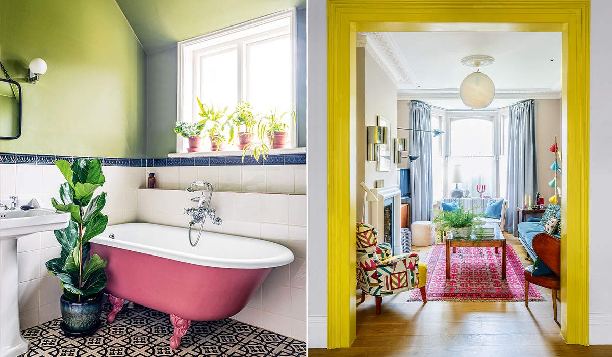
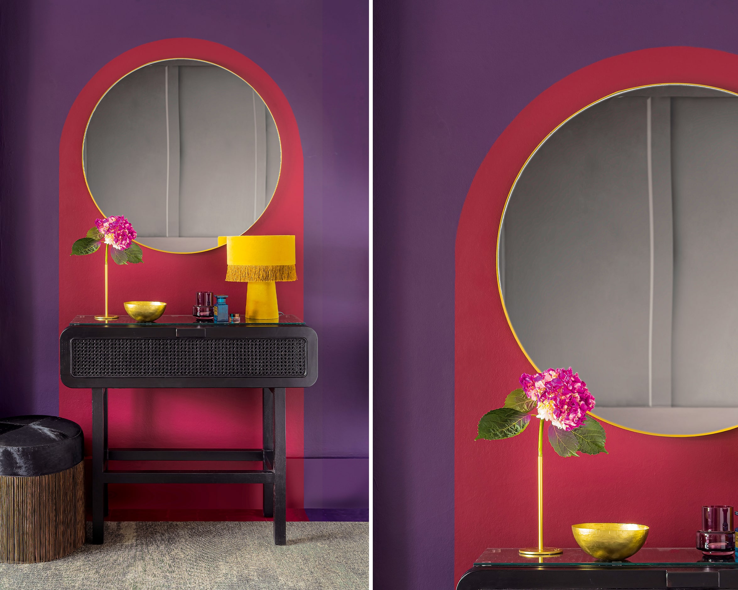
FRAME WORK
Bright colours can also be used to demarcate different zones in your living space. This bright yellow moulding clearly frames the entrance to the compact living area beyond where a collection of colourful decor elements have been set against a tan backdrop that helps them hang together.
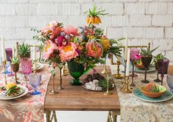
BERRY GOOD
Darker, moodier colours have an enveloping effect, making a space feel snug and cocoon-like. Deep reds and purples are best paired with dark-wood furniture for a plush place you can retreat to for total relaxation.
COLOUR CLASH
Contrasting colours and patterns can work together to create a surprisingly coherent look in a relaxed setting that sets the mood for fun. There are a few golden rules you should follow: stick to solid colours on the couch, walls and fixed furniture pieces and add playful pattern with items such as cushions, throws and rugs so that you can easily change your look or tone things down if you start to feel like it’s a bit ‘much’.

BLUE PERIOD
You can choose to go all in and create an immersive effect like this blue room in which a similar tone of a single key colour has been applied to everything from the furniture to the carpet and walls. This type of execution creates a sense of opulence, a luxe effect that in this instance is enhanced by tactile fabrics such as velvet.
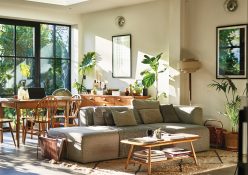
GREEN SCENE
Green is definitely having a moment, we’ve seen it everywhere from fashion catwalks to the latest decor trends. It’s not surprising, as green is known for its calming effect and is a great way to reflect nature in your space (especially if you can’t keep a plant alive).
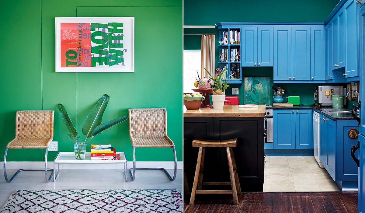
KITCHEN COOL
You don’t have to be stuck with a boring brown kitchen from the 70s. If you’re not ready to gut the place, consider a fresh lick of paint over doors and drawers. It’s surprisingly easy to detach front-facing panels which can be painted by a professional for a smooth finish.