
We take the best colour trends from Milan Design Week 2018 and translate them into our homes – consider this as your guide to incorporating colour-trends into your home.
1. Richard Yasmine
Some might say the millennial-pink trend was short-lived and, frankly, over, but Richard Yasmine shows us otherwise. To raise awareness about climate change, he created a collection of table lamps with handblown light bulbs resting on birds’ nests, alongside semi-precious stones. His backdrop, however, consisted of clean lines in contemporary versions of millennial pink, in comparison to the natural nuance of his design elements.
Easily recreate the look in your own home by thoroughly cleaning and painting an entire wall crisp white. Depending on your preference, measure and mark the areas you want the vertical (or horizontal) lines to be with painter’s tape. Paint these sections in variations of millennial pink to musky mauve, but leave the biggest space white.

2. Hermès
Hermès took us on an energising journey through bold finishes and electric shades of yellow, red, blue and violet. Walls covered in Moroccan zellige – a square tile of glazed earthenware – made for spaces that wowed, and needed little to no extra frills.
For a personal take on the colourblock trend, choose a space such as a bathroom or kitchen, and make sure the walls are clean and smooth. Apply an adhesive, leaving no spaces or joints between the tiles. Spread a liquid grout cement over the entire tiled area, and make sure that any little spaces are filled. Allow grout to dry for about 15 minutes, remove leftover cement on the tiles with a clean cloth.

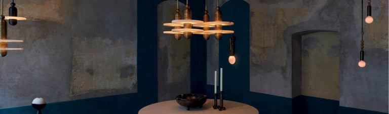
3. Act III by Apparatus
Creative Director Gabriel Hendifar took inspiration from his personal heritage and turned it into something beautiful. With his starting point being the ancient technique of Persian khatam inlaying, he used colours such as grey, terracotta, beige and turquoise to create the appearance of stone walls that look distressed, yet contemporary. What makes it unique is the strip of turquoise, a colour associated with royalty in Iran, at the bottom, that flows into and matches the floor.
To translate this into your own home, start with a base colour of terracotta on the entire wall, then colour-wash bigger areas with grey and beige, respectively. Don’t worry about being neat, as you want the look to be patchy and imperfect.

4. Six Gallery
Exposed brick gets a well-deserved update with a thick coat of matte black at Six Gallery, for a moody, sophisticated feel. The new creative space, inspired by African and American deserts, overflows with tropical vegetation and antique furniture, creating a space that is warm, trendy and innovative.
If your exposed brick walls are lacking a little imagination, vacuum and clean any loose bits and pieces that might have gathered with time. Allow the wall to dry completely for 12 hours or more. Next, use a filler to mend any cracks. Use a roller or brush to apply a primer, depending on how rough the texture of the bricks is. Once the area is primed and dry, apply at least two coats of water-based acrylic paint.
Read more on how to incorporate the best colour trends into your home in your September issue of Livingspace.