
In design, colour is more than a basic visual choice – it’s chemistry. We show you how playing with colour palettes and styles can set the tone for romance.
The right colour palette can shift a room’s energy instantly, changing how we feel, move and even connect within a space. We spoke to the experts at Zest and Honey Interior Design Studio (ZH Studio) about how colour, when introduced intentionally, can be used to create romantic interiors, guiding mood in delicate yet powerful ways. Think layers of muted blush, deep plum or warm tones suggesting intimacy and warmth. When paired with tactile finishes (think wicker, velvet, natural linen or aged brass), your colour palette can come to life.
It is the balance between contrast and harmony, bold and soft light and shadow that gives colour its emotional pull. So whether you’re inspired by the elegance of French Romance, the moody luxury of Dark Romance, the sunlit ease of Country Romance, or the free-spirited energy of Bohemian Romance, these design styles come with distinct colour palettes where love lives in the details.
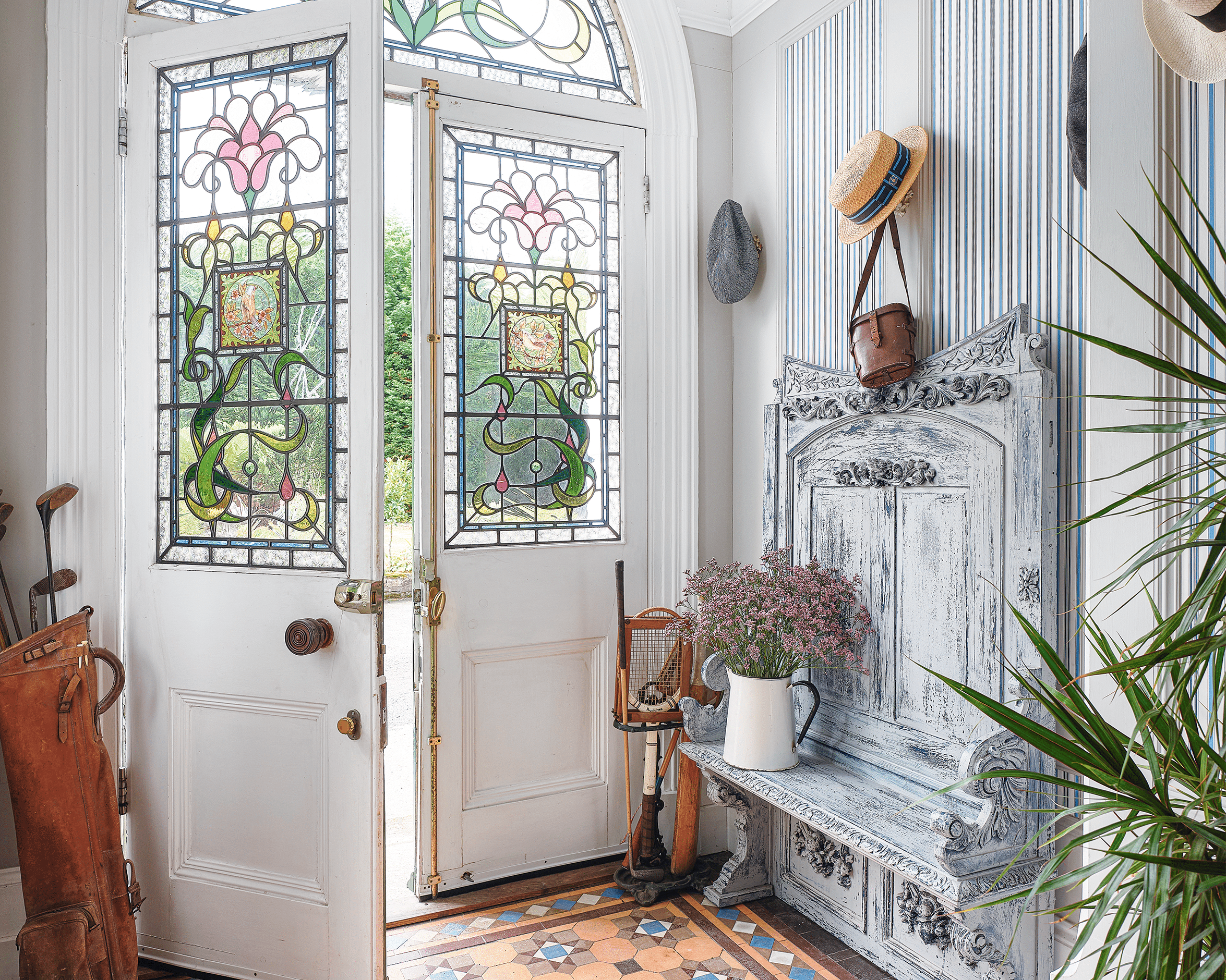
French romance
Evoking a sense of timeless elegance and sophistication, French Romance is all about quiet opulence and charm.
Think Parisian apartments kissed by natural light, ornate chandeliers glimmering above aged parquet floors and soft linen drapes swaying in the afternoon breeze. The palette whispers in subtle tones of off-whites, rich creams, beiges and darker, earthy shades. It is then layered with brass or gold details such as vintage mirrors and furniture, as well as gilded accent frames and decor alongside delicate florals, lace and crystal. This is a style where refinement meets intimacy, in a gentle balance between grandeur and sensual simplicity.
@plasconpaintexpert Welcome the romantic essence of France into your spaces with this bespoke French Country Chic Colour Palette by Plascon Paint Expert. Get these and thousands of other colours tinted instore now! #colourinspiration #plasconpaintexpert #colourexpert ♬ original sound – Plascon Paint Expert
Top tip: When going into an interior design project, ZH Studio recommends using a colour rule to maintain a balanced distribution, with 60% being your dominant colour, 30% for a secondary colour, and 10% for an accent colour.
Dark romance
This enchanting design style speaks to a moody luxury interior, which serves as a backdrop for glamour and whimsy. It heroes a colour palette where shadows meet light in a dance of drama thanks to velvety textures, deep jewel tones and an air of mystery. Darkened walls in inky charcoal are contrasted by medium warm, wood-toned furniture and floor elements. To further enhance the mood, opt for lots of low-lit ambient lighting while filling the space with decorative antique pieces in brass or patina. Finally, introduce contrasting opulent jewel-tone colours through scatter cushions and fabric choices that can be complemented by touches of tasteful florals. In this way, you set the tone for every object to tell a story, where every corner feels alive with intrigue.
View this post on Instagram
Bohemian romance
Release your free-spirited nature through a design sensibility that rebels against luxury, minimalism and overall rigid curated spaces. The Modern Bohemian (Boho) aesthetic plays out in various ways within interiors, as it loosely interprets features of nomadic lifestyles through symbols of music, dance, arts and culture. A modern look at a bohemian-inspired colour palette mixes earthy tones with an array of vibrant colours drawn from multicultural pattern and textiles. Start with a light cream as a base colour, then mix in rich warm hues of terracotta, rust, orange, burgundy and reds for warmth. Saturated jewel tones such as emerald, sapphire, amethyst, mauve and topaz yellow work well in accent pieces. In this way, a Boho interior becomes a romantic setting where eclectic colour schemes and personal stories unfold effortlessly.
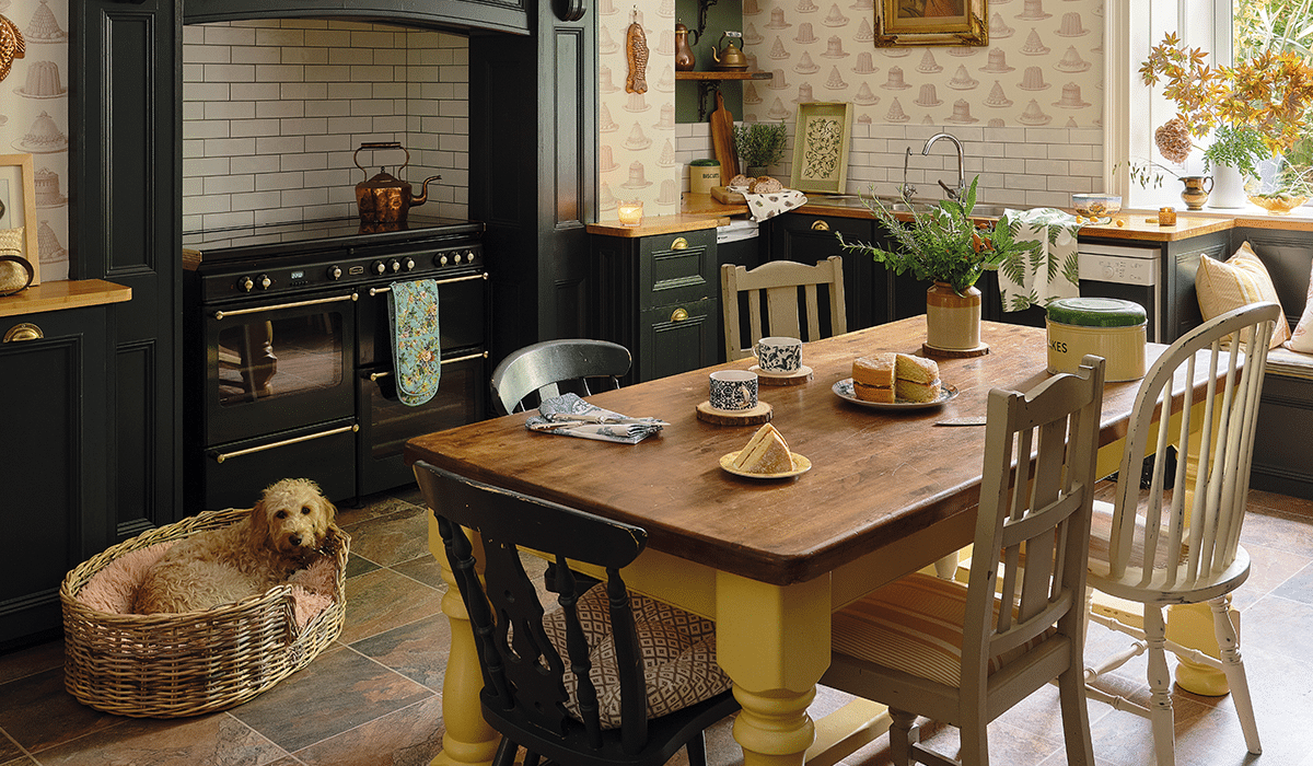
Country romance
The countryside ideal looks different all over the world, but for many the desire resides in its quiet and rural escape. Rolling green hills dappled with cattle, woolly sheep and wildflowers meet an ever-changing blue-grey sky to form the perfect harmony of colours to inspire your good ol’ countryside interior. Begin with clean neutrals as the dominant colour on walls and main furniture pieces. Build interest into the neutral space with rustic woody colours, brown leathers, stone features and animal print hides. Round it all up with decorative pieces and artworks in darker woods, terracotta accents, warm greens and generous plant life to create a grounded living space that holds you in a homely embrace.
ZH studio’s advice
Colour palettes play an important psychological role in our homes. When applied purposefully, colour has the ability to enlarge spaces, breathe fresh air into an area, or evoke a calm and tranquil atmosphere. It can transform a home into a personal sanctuary. Colour palettes incorporate a range of shades that work well together and make sense when applied throughout a home. You can always experiment with pops of colour, styles and techniques as long as the dominant colour is used throughout the home. When trying to achieve a specific interior design style, less is always more. Select one or two focal furniture pieces that encompass your favourite style, then begin to layer it with accent pieces such as scatter cushions, throws, artworks, feature walls, lighting and decor items. Your accent pieces will share colours from your desired colour palette without overwhelming the space in one colour or too many colours. Start small if colour is not your thing: Begin with a base shade, then slowly start choosing decorative items in colours that truly bring you joy and make sense for the room. Add these to your space.
Words: Claudia Da Silva
Photography: Future content hub, Bureaux
Also read: Tips to design your outdoor space