From eclectic patterns to dark bathrooms, challenge the norms of interior design by creating a space that reflects your individuality and truly feels like home.
Interior design trends tend to be more rigid than others. Most people create their space to be ‘timeless,’ by playing it safe, following traditional rules, and veering away from chopping and changing furniture or boldly spraying paint across the walls. However, a home should be uniquely yours — a reflection of your personality, preferences, and lifestyle. It’s time to do away with conventional design rules and embrace the freedom to craft a living environment that truly works for you. Here are seven common design rules and stylish ways to break them:
Dark & daunting
Rule: Bathrooms should be light and bright.
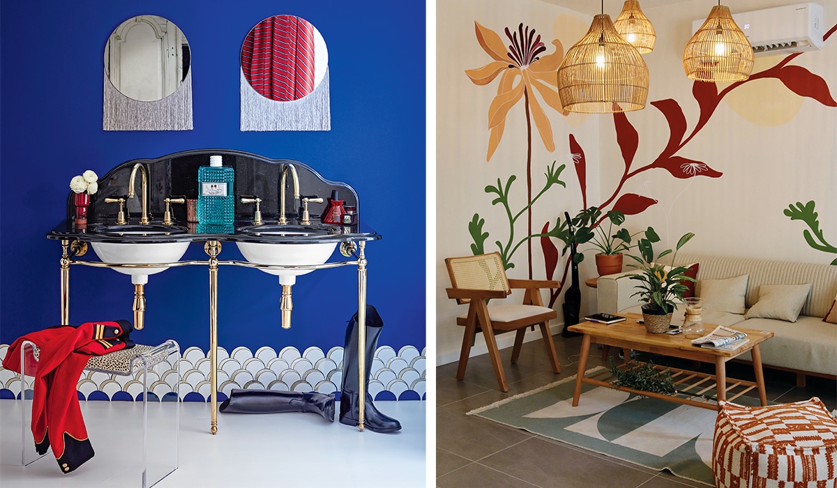
How to break it: Colour palettes in bathrooms have traditionally been on the lighter, brighter side to make the environment feel clean and airy. But darker tones, especially black, have been fashion staples for years and it only makes sense for that colour trend to segue into homes. Even though a bathroom might seem like an unusual choice for darker tones, it can add refinement, intimacy, and sophistication to the space. It’s important to remember that striking the right balance is key — opting for deep hues such as navy, charcoal, or emerald green, paired with contrasting fixtures in brass, silver, or gold (along with some ambient lighting and lush green plants) can enhance the cosy, spa-like atmosphere.
Decoration & adornment
Rule: Bathrooms should only have the essentials.
How to break it: Introducing furniture into your bathroom transforms the space into a sanctuary for comfort and relaxation. A vintage armchair, a stylish ottoman, or a small bookshelf can transform the space into a luxurious retreat in a home. Blending function and comfort can make your bathroom feel more like a living space, perfect for winding down after a long day.
Even though a bathroom might seem like an unusual choice for darker tones, it can add refinement

A maximalist dream
Rule: Stick to one pattern to avoid visual chaos.
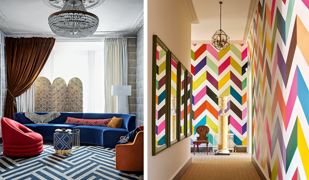
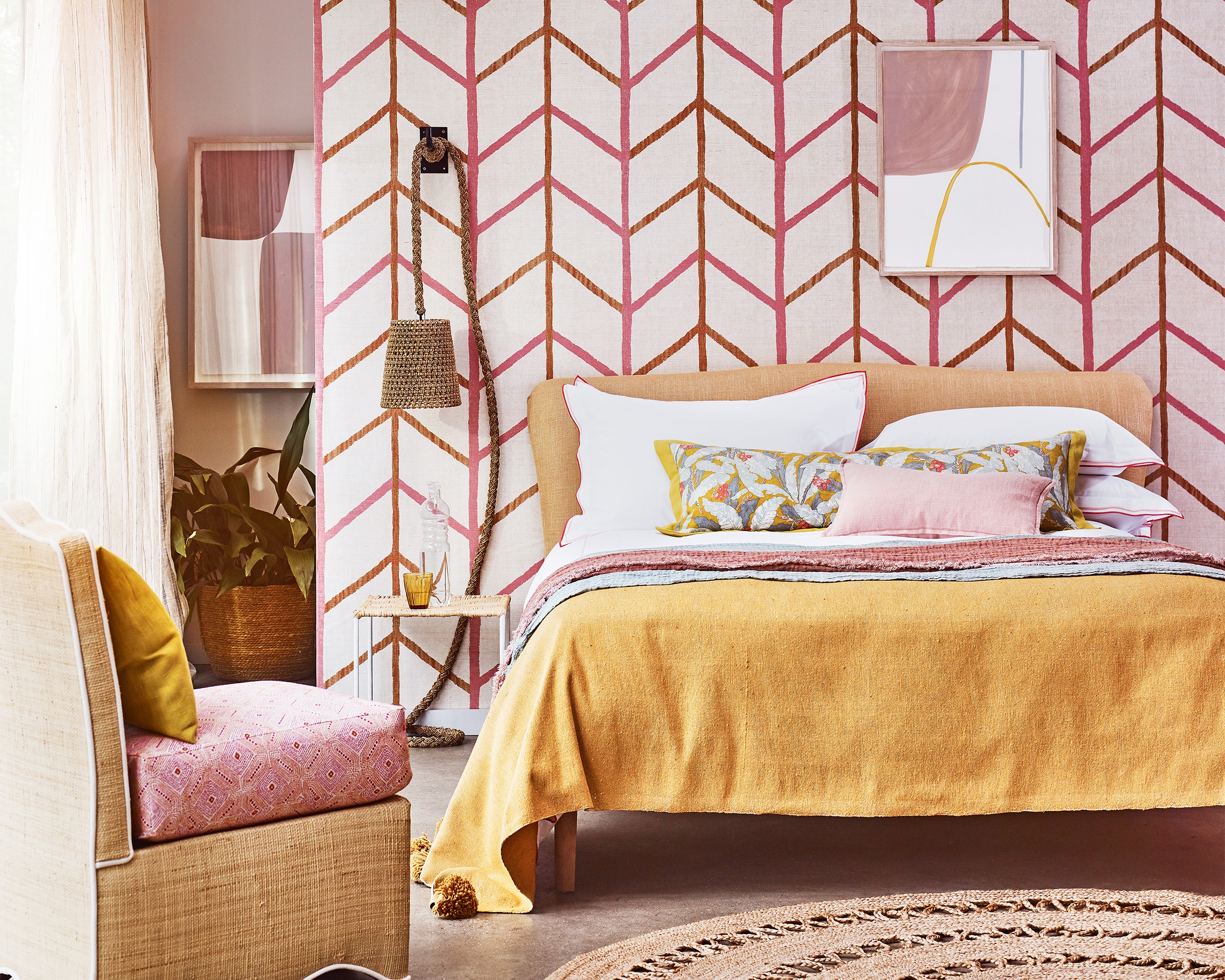
How to break it: Sticking to one pattern is blasé. Maximalism has come into its own recently as it meets at the intersection of personality and sentimentality — adding depth and character to your space. Mixing and matching patterns brings a sense of visual interest to a space, whether you choose to combine florals, stripes, and geometrics or contrasting colour palettes. Daring to be bold with patterns doesn’t have to be extreme, you can always bring a subtle touch of pattern in the form of scatter cushions, artwork and other small accessories.
Always asymmetrical
Rule: Matching dining room chairs or bedside tables are a standard.
How to break it: The days of buying two or more of one particular thing are coming to an end. Cohesion does not necessarily mean that things have to be the same; things can still be cohesive by sharing similar colour schemes or having an overarching motif, be it a regional influence or oscillating between new and antique pieces. Mixing and matching dining room chairs is a unique way to bring some character into your home’s dining area, whether you’re playing with different materials, sizes, or even colours. Juxtaposing pieces that technically should ‘match’ can also be done with bedside tables, bar stools, sofas, and side tables. Choosing pieces you like best will prevent your home from looking like a staged showroom.
Bringing in architectural details could change the atmosphere of the whole area

Look up
Rule: Ideally, ceilings should be neutral and unobtrusive.
How to break it: Ceilings are often forgotten about from a design perspective even though they offer so much space for experimentation. A plain white ceiling is definitely a safe option, but bringing in architectural details could change the atmosphere of the whole area. Think pressed ceilings, wooden beams, or wallpaper to draw the eye upward, creating another point of visual interest in a room. Ceilings really are the fifth wall in a home and you don’t need to recreate Sistine Chapel to add a unique, stylish touch.
Ditch the dining room
Rule: Every home needs a formal dining room.
How to break it: Formal dining rooms aren’t as functional as they once were, as we live in the age of watching something on TV while having dinner on the couch. If a grand dining space doesn’t suit your lifestyle, you can repurpose the area to fit your needs, whether it’s a home office, an intimate reading nook, or an extra lounge. Open-plan living areas can create a more flexible, functional environment, making the most of your home’s square footage.
By: Shai Rama
Photographs: Future Content Hub, Pexels
Also read: 4 tips to spruce up your decor for summer


